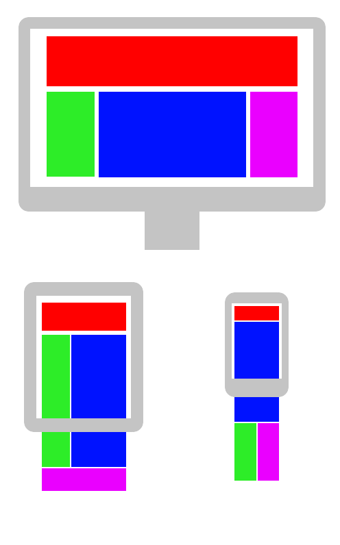
Responsive Design
Responsive design is a way of formatting and designing a site so that it continues to look good and remain useable for mobile, tablet and desktop. Often this is done via a mobile-first approach. Mobile-first means that you make sure the site works on mobile screens before you then make it functional on larger viewports.
Responsive web design (RWD) is an approach to web design that makes web pages render well on a variety of devices and window or screen sizes. Recent work also considers the viewer proximity as part of the viewing context as an extension for RWD. Content, design and performance are necessary across all devices to ensure usability and satisfaction.
Responsive web design, Wikipedia
Some design frameworks – such as Bootstrap – can help with creating a responsive design. If you use a CMS (such as WordPress or Joomla), look for themes that are categorised as responsive or mobile adaptive.
Why Responsive Design Matters
According to one source, 63% of web traffic comes from users on mobiles or tablets. According to another source, mobile bounce rate is 50%.
Without a site that is still pleasant to use you instantly lose around 31% of potential readers. A responsive design can drastically cut that number.
Further reading